Blog
Custom branding mistakes that you should never make
There are an enormous number of factors that can affect the way people perceive your business and the products you sell. But branding is the cornerstone of the whole image of your product – how people first see it, how they think about it in their head. Even simple choices like colours used, font types, logo shapes can have a massive impact – whether you’re using them on bespoke labels or on television advertising.
Here are a few examples of branding gone wrong – from some of the biggest companies we know…
Starbucks
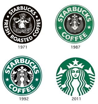
The Starbucks logo is well recognised: a female figure, or mermaid, originally used to represent the company’s Pacific Northwest origin. Up until 2011, the words ‘Starbucks Coffee’ were also included, giving meaning to this seemingly unconnected image. However, they made the mistake of removing these words, making the logo unclear and confusing many potential customers. You should never assume your brand is recognisable enough to remove a key element.
Pepsi
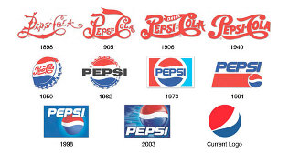
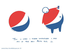
Pepsi also made the mistake of removing its name from the logo recently. Not only did this confuse people, but worse: there was a lot of backlash as alone the ball supposedly looks a bit like a fat belly. Not a great image for a fizzy drinks chain. You should make sure you listen to your audience before making dramatic changes, and also make sure you compare your logo with those of competitors.
GAP
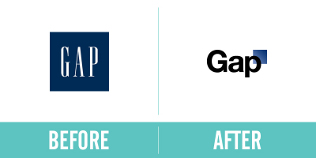
Gap clothing, another extremely well known brand, decided to do a massive overhaul of its look in 2010. It changed its logo entirely, going for a more modern feel with the thin white letters on the blue background, as opposed to the previous blue box and Gap written in the centre. Again, this change caused a lot of waves among those loyal to the original brand. With this too, they should have consulted their audience. It’s always worth setting up focus groups before making these kinds of changes to a bespoke label.
Myspace
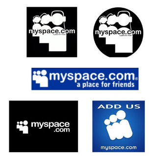
Unlike the other big names in social media, Myspace has never caught on as a business tool, and this is largely down to its poor branding. Its mistake was trying to market itself as a young, trendy network not to be taken too seriously. The peg people are generic and difficult to recognise on their own without the brand name – unlike Twitter and Facebook, for example, which are easy to recognise from one small icon.
Animal Planet
Animal Planet, the learning portal on animals, has also had an unfortunate logo re-brand. As opposed to the name and an image of an elephant, they’ve scrapped the animal and now only use the letters. They’ve also moved the “M” on to its side, which looks a bit strange. Without the elephant, or any identifiable shape, there is no link to animals and no easily recognisable association.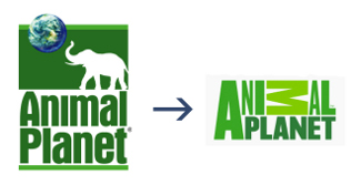 image source
We can learn a lot from all of these brands: redesigns are always risky, and taking something out of a logo may not always improve it. Make sure you do proper research when you’re developing your branding – it will be worth it in the long run.
Check out similar posts below: