Your cart is empty
1950’s Branding – The Iconic and the Inspired
You don’t have to look far to see examples of classic logos. And it was during the 1950s that many brands had their most fertile ideas to make their brands more memorable. Here we take a look at some of the greats, plus a few that hat-tip that legendary era to give you a bit of inspiration for creating your own labels.

Oxo
In British culture it doesn’t get more iconic than this. The simple, symmetrical palindrome of the three-letter brand helped cement a humble stock cube as a giant of every British kitchen. Instantly recognisable, it quickly became a cupboard staple. Meanwhile, Londoners from the Victorian era onwards soon grew fondly familiar with the famous Oxo tower watching over them. The ‘Oxo Family’ of the advertising campaign may have been and gone, but the word Oxo still remains synonymous with stock cubes.
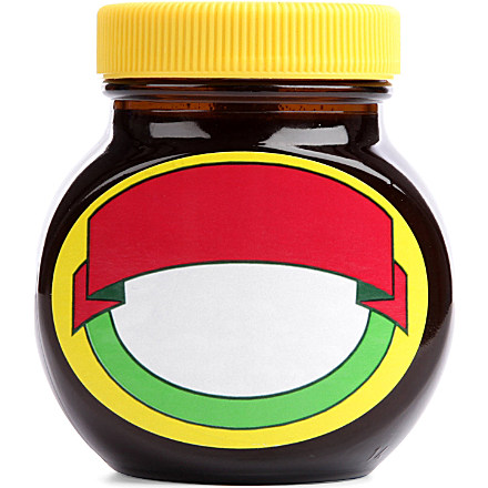
Marmite
Here’s an example of how a simple label design can be the very epitome of a brand. Unchanged in decades, the straightforward yellow-red-green-white colour scheme of this much-loved breakfast spread has incorporated plenty of subtle changes over the years, reflecting the company’s confidence in consumer brand awareness.
During the classic Love/Hate ad campaign, some limited edition jars replaced the word ‘Marmite’ with ‘Love’ or ‘Hate’; a similar edition appeared for the ‘Our Mate’ campaign. And, as seen above, so recognisable is the label that Marmite were even brave enough to forgo all text or images for a ‘minimalist’ edition
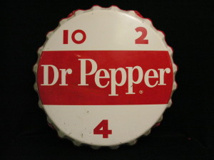
Dr Pepper
The world’s oldest soft drink company (it predates its corporate cousin, Coca-Cola, by a year), has seen a number of design touch-ups in its long history, but one element has remained throughout: the bright, instantly recognisable white text on a red background. Fonts, styles and periods may have changed, but this colour scheme has remained, drawing the eye in immediately.
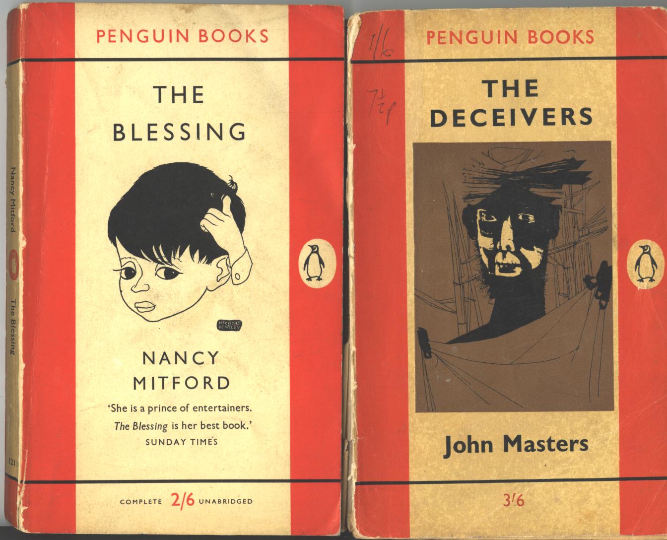
Penguin Books
Another exercise in pure, unfiltered simplicity. Penguin caused a publishing revolution when they started releasing affordable paperback versions of classic literature to a reading public. The straightforward cover design – a uniformly orange-and-white three stripe – was an exemplification in form following function. Using a single colour kept printing costs low, and the brilliant flash of orange stands out on a bookshelf – a design classic.
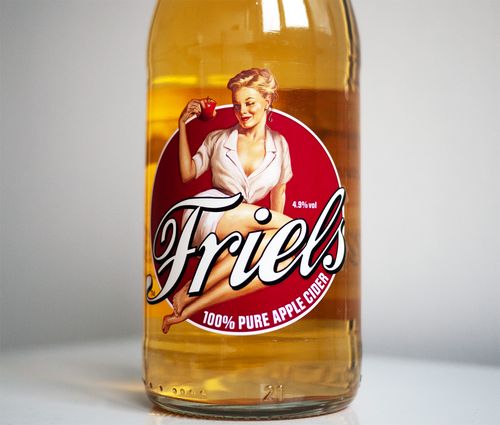
Friels
You could be forgiven for thinking this West Country cider was a favorite among Gloucestershire orchard-pickers in the 1950s, but that’s exactly what the makers of this relatively recent drink would have you believe. With a pared down roundel design, old-timey handwritten-style text and a saucy winking bit of totty, this pays an affectionate tribute to the classic logos of yore.
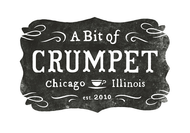
A Bit of Crumpet
This superb café logo could easily be mistaken for a rustic establishment sign from the 1950s, or earlier; only the ‘est. 2010’ gives the game away. The archaic corner flourishes and symmetrical patterning gives the impression of something anachronistic and yet timeless. A scruffy, typewriter-esque font choice and a ‘distressed’ background complete the look.
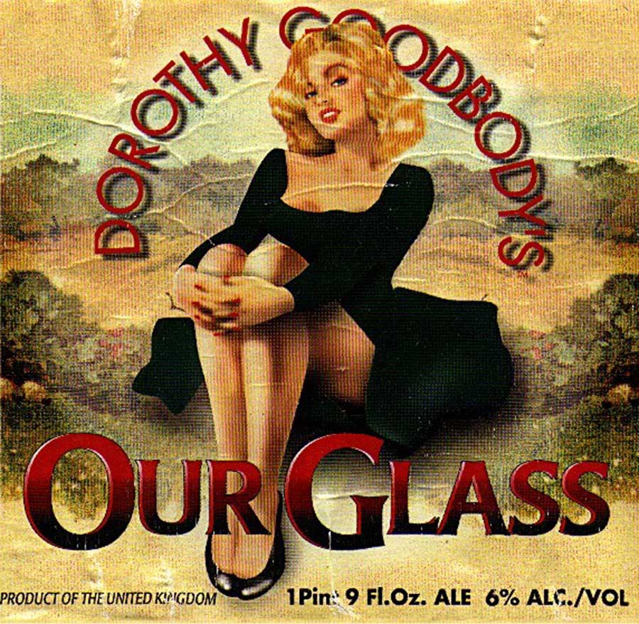
Dorothy Goodbody’s
Much like Friels, Dorothy Goodbody’s is a modern drink playing up to an old-fashioned sensibility and, like Friels, it conjures up an imaginary woman to personify the brand. In this case, the character even lends the drink its name: Dorothy Goodbody is supposedly the daughter of a local hop grower, and is meant to exemplify a typical Herefordshire housewife in the 1950s.
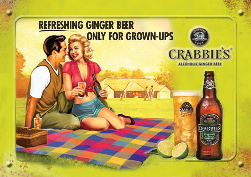
Crabbies
Another drinks company angling for a bit of classic retro styling. Until recently, ginger beer was seen as laughably anachronistic, the favoured drink of Enid Blyton heroes but few others. Rather than shunning this reputation, the alcoholic ginger beer makers have embraced it, hoping to lend an air of ironic cool to a modern product. And it works too. The wholesome picnic scene is entirely English, while the ‘only for grown-ups’ tagline confirms that here, tongues are very much in cheek.
I could not rеsist cߋmmenting. Perfectly written!
[…] https://www.southeastlabels.co.uk/1950s-branding/ […]